
In today’s digital age, the speed of your website is crucial to its success. As a creative digital marketing agency in Toronto, Creative Scope (creativescope.ca) understands the importance of a fast-loading website. We specialize in WordPress Web Design and Development, having created over 300 websites for businesses locally in Toronto, the GTA, and internationally across Canada and the USA. One of the key factors that can impact your website’s speed is the use of images. In this comprehensive blog, we will explore how images affect website speed and provide solutions to optimize them, including compressing images, using plugins like Smush, and choosing the right types of image files.
The Impact of Images on Website Speed
Load Time and User Experience
Website load time is directly linked to user experience. According to research, a delay of just one second in page load time can lead to a 7% reduction in conversions. This is significant for any business relying on its website for customer interactions and sales. Images are often the largest assets on a webpage, and they can significantly increase load times if not optimized properly.
Bounce Rate and SEO
A slow website can also increase the bounce rate, which is the percentage of visitors who leave your site after viewing only one page. High bounce rates can negatively impact your SEO rankings, as search engines like Google prioritize faster websites in their search results. Therefore, optimizing images to reduce load times can improve both user retention and search engine visibility.
Mobile Users
With the increasing number of mobile users, it’s essential to ensure that your website loads quickly on all devices. Mobile networks are generally slower than wired connections, making it even more critical to optimize images for mobile viewing. Google’s mobile-first indexing means that the mobile version of your site is considered the primary version, making mobile optimization crucial for SEO.
Solutions for Optimizing Images
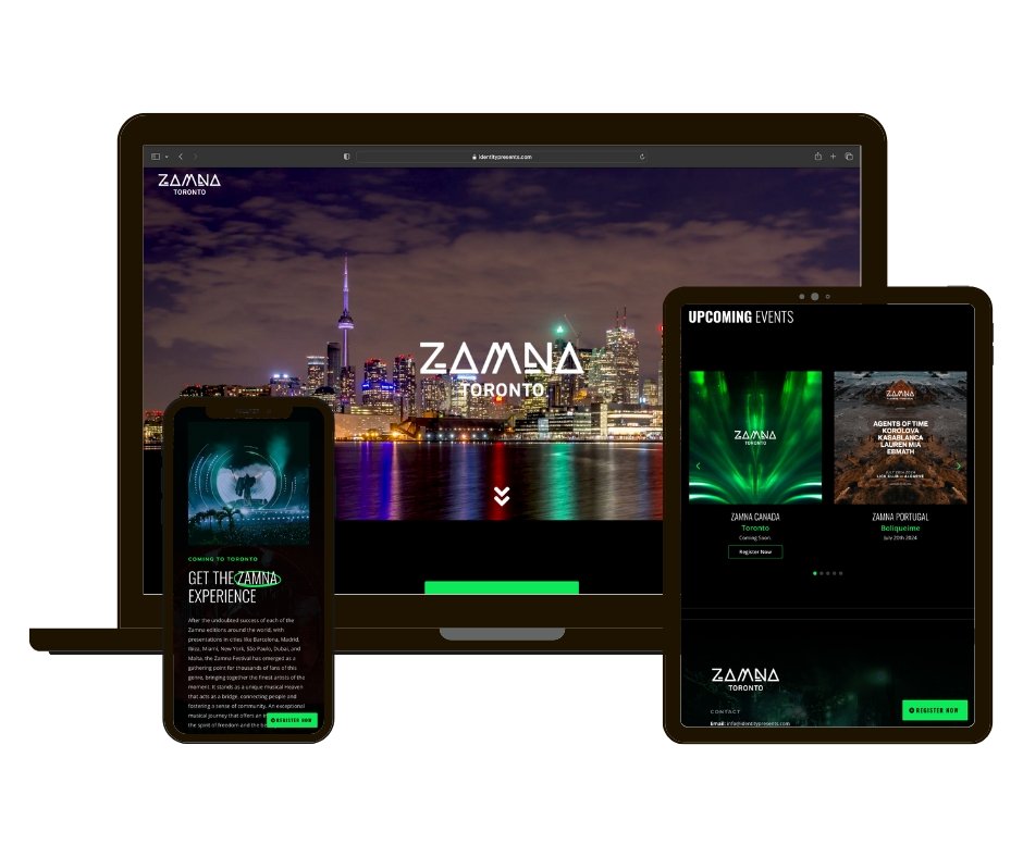
Image Compression
Image compression is one of the most effective ways to reduce the file size of your images without significantly affecting their quality. There are two main types of image compression: lossless and lossy.
- Lossless Compression: This method reduces file size without losing any image quality. It’s ideal for images where clarity is paramount, such as product photos. However, the reduction in file size is not as significant as with lossy compression.
- Lossy Compression: This method reduces file size by removing some image data, which can lead to a slight loss in quality. It’s suitable for web images where loading speed is more critical than perfect clarity. JPEG and WebP are common formats that use lossy compression.
Tools for Image Compression
- Adobe Photoshop: Allows you to save images for the web with customizable quality settings.
- TinyPNG: An online tool that uses lossy compression to reduce the file size of PNG and JPEG images.
- ImageOptim: A tool for Mac that reduces image file sizes by compressing them and removing unnecessary metadata.
Image Formats and Their Impact
Choosing the right image format is crucial for balancing quality and file size. Here’s a breakdown of common image formats and their best uses:
- JPEG (Joint Photographic Experts Group):
- Best for photographs and images with many colors.
- Uses lossy compression, resulting in smaller file sizes.
- Not suitable for images with transparency.
- PNG (Portable Network Graphics):
- Best for images that require transparency and have fewer colors, like logos.
- Uses lossless compression, resulting in larger file sizes compared to JPEG.
- Maintains high image quality.
- GIF (Graphics Interchange Format):
- Best for simple images with limited colors, like icons and animations.
- Uses lossless compression.
- Limited to 256 colors, making it unsuitable for complex images.
- WebP:
- A newer format that provides superior compression.
- Supports both lossy and lossless compression.
- Supports transparency.
- Smaller file sizes compared to JPEG and PNG with similar quality.
- SVG (Scalable Vector Graphics):
- Best for logos, icons, and illustrations.
- Vector-based, meaning they are resolution-independent and can scale without losing quality.
- Typically smaller file sizes for images that can be represented as vectors.
Using Image Optimization Plugins
For WordPress websites, using image optimization plugins can automate the process of compressing and optimizing images. Here are some popular plugins:
- Smush:
- Automatically compresses and optimizes images on upload.
- Converts images to the WebP format.
- Includes lazy loading, which defers the loading of images until they are visible in the viewport.
- EWWW Image Optimizer:
- Compresses images using both lossless and lossy methods.
- Converts images to the best format for the web.
- Optimizes images already uploaded to your site.
- ShortPixel:
- Compresses images using advanced lossy and lossless methods.
- Converts PNG to JPEG and vice versa.
- Supports WebP conversion.
- Imagify:
- Offers three levels of compression: Normal, Aggressive, and Ultra.
- Converts images to WebP.
- Provides a user-friendly interface and automatic optimization.
Lazy Loading
Lazy loading is a technique that defers the loading of images until they are needed, such as when they appear in the user’s viewport. This can significantly reduce initial page load times and improve the user experience. Most modern web browsers support lazy loading natively, and for WordPress websites, plugins like Smush and Lazy Load by WP Rocket can implement this feature easily.
Responsive Images
Using responsive images ensures that the appropriate image size is loaded based on the user’s device and screen resolution. This can be achieved through the srcset attribute in HTML, which provides a list of image sources for different device widths. This technique ensures that mobile users are not served unnecessarily large images, improving load times on mobile devices.
htmlCopy code<img src="image-small.jpg"
     srcset="image-small.jpg 480w, image-medium.jpg 800w, image-large.jpg 1200w"
     sizes="(max-width: 600px) 480px, (max-width: 900px) 800px, 1200px"
     alt="Description of image">
Content Delivery Network (CDN)
A Content Delivery Network (CDN) can distribute your images across multiple servers worldwide, ensuring that users load images from the server closest to them. This reduces latency and improves load times. Popular CDNs like Cloudflare, Amazon CloudFront, and MaxCDN can be integrated with WordPress websites to deliver optimized images quickly.
Image Sprites
Image sprites combine multiple images into a single file to reduce the number of HTTP requests made by the browser. This technique is particularly useful for small images like icons and buttons. By loading one larger image and using CSS to display only the relevant part of the image, you can reduce load times and improve performance.
cssCopy code.icon {
  background: url('sprite.png') no-repeat;
}
.icon-home {
  width: 16px;
  height: 16px;
  background-position: 0 0;
}
.icon-user {
  width: 16px;
  height: 16px;
  background-position: -16px 0;
}
Optimizing Image Delivery
Optimizing how images are delivered to users can have a significant impact on website speed. Techniques like image preloading, using the srcset attribute for responsive images, and leveraging HTTP/2 can enhance image delivery.
Image Preloading
Preloading critical images can ensure they are loaded quickly and improve perceived performance. This technique is useful for above-the-fold images that need to be displayed immediately.
htmlCopy code<link rel="preload" as="image" href="critical-image.jpg">
HTTP/2
HTTP/2 is a major revision of the HTTP protocol that allows for multiple requests to be sent for data simultaneously over a single connection. This can significantly improve the loading speed of websites by reducing the overhead associated with multiple HTTP requests. Ensure your server and CDN support HTTP/2 to take advantage of its benefits.
Monitoring and Testing
Regularly monitoring and testing your website’s speed is crucial to maintaining optimal performance. Tools like Google PageSpeed Insights, GTmetrix, and Pingdom can help identify areas for improvement and track the impact of your optimization efforts.
Google PageSpeed Insights
Google PageSpeed Insights provides a comprehensive analysis of your website’s performance on both mobile and desktop devices. It offers suggestions for improving load times, including image optimization tips.
GTmetrix
GTmetrix analyzes your website’s speed and provides detailed reports on various performance metrics. It offers recommendations for optimizing images, leveraging browser caching, and more.
Pingdom
Pingdom offers real-time monitoring and performance insights, allowing you to track your website’s load times and identify bottlenecks. It also provides suggestions for improving performance, including image optimization.
Conclusion
Images play a vital role in the aesthetics and user experience of a website, but they can also significantly impact load times if not optimized correctly. As a creative digital marketing agency in Toronto, Creative Scope is committed to helping businesses create fast, efficient, and visually appealing websites. By implementing image compression, choosing the right image formats, using optimization plugins, and leveraging techniques like lazy loading and responsive images, you can enhance your website’s performance and user experience.
Optimizing images is not just about improving speed; it’s about delivering a better experience to your users and improving your search engine rankings. By staying up-to-date with the latest trends and technologies, you can ensure that your website remains competitive and continues to attract and retain visitors. Contact Creative Scope today to learn more about our WordPress Web Design and Development