With the rapid growth of smartphone use, it’s no secret that more and more people are accessing the internet using their mobile devices in addition to or in place of desktop computers. As a result, companies who have a responsive web design offer a more seamless user experience, and consequently generate more leads and have a competitive advantage over companies that don’t. It is becoming an industry standard that a website is mobile friendly. Here’s what Creative Scope can tell you about it:
What is responsive web design?
Responsive web design is dedicated to adapt to the screen of the device the visitor is using. It allows for easy reading and navigation with a minimum of resizing, panning and scrolling. This gives the ability to respond to any movements you make to the screen without compromising functionality or aesthetics.
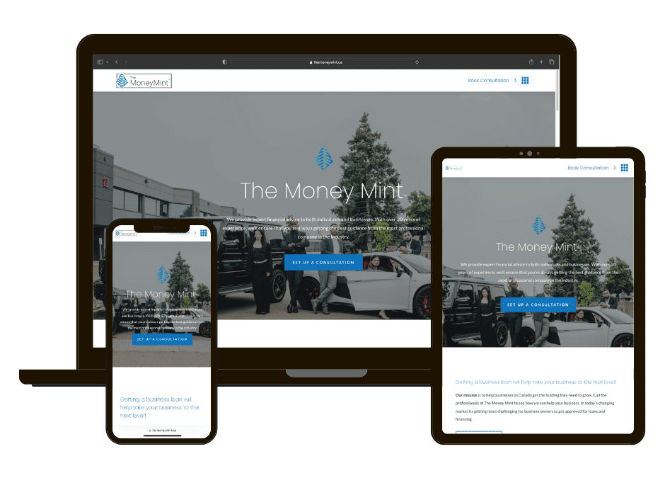
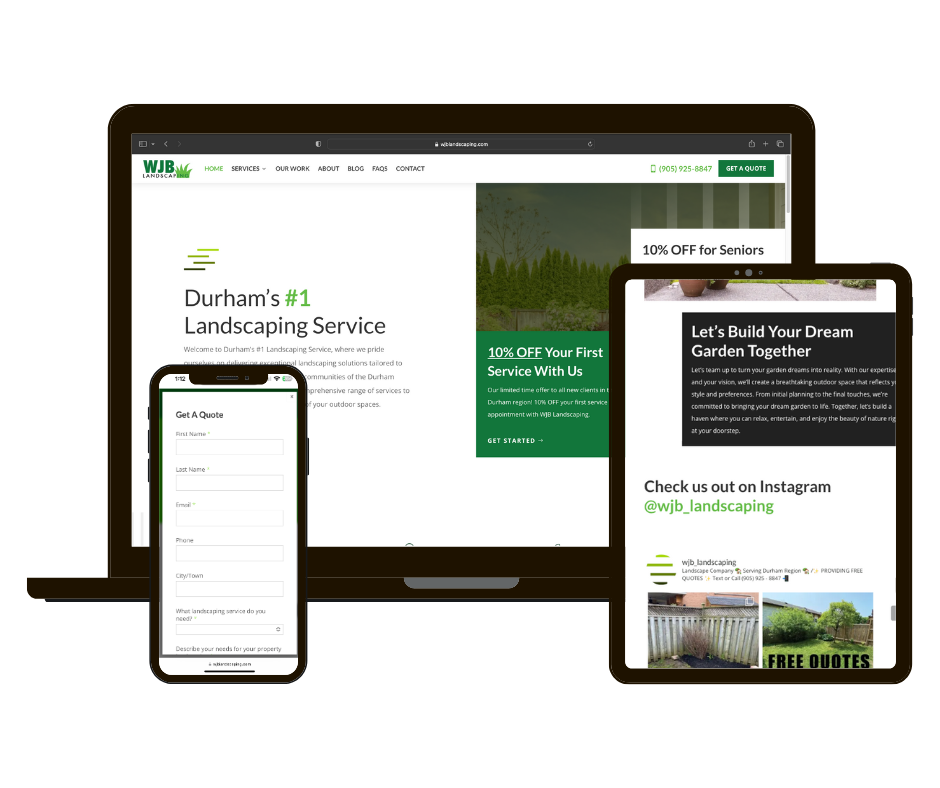
Here is an example of what a web responsive design looks like:
How does it work?
Without getting too technical, there are three main components that drive responsive design.
- Fluid Grid Systems
- Fluid Image Use
- Media Queries
Fluid Grid Systems
Before the internet, prints were determined by the size of what would be displayed in absolute measures. However, for responsive web design, the absolute size won’t work. Instead, web developers use the idea of relative sizes rather than absolute ones.
Fluid Image Use
This tells the browser that the image should be a maximum 100% of its pixel value and that It should scale according to its container. This idea prevents an image from being stretched when the container becomes larger than the image and the opposite.
Media Queries
Media queries are designed to alter the layout of the site when certain conditions are met. The idea is to use this feature when the screen real estate should be rearranged. Hence it is best to work with a “mobile first” approach where you define what you want on mobile and scale up.
Why you should have a responsive web design?
- Higher Conversions
It is proven that a responsive website generates more leads and high conversions than a non-responsive website. Understanding that in our generation today, more than half of users will reach a website through their phone. If visitors have to zoom in and out to find everything they need and constantly scroll to browse pages will most likely result in them going back to Google to find another website. A responsive website will increase the likeliness of the user sticking around for a longer period of time thus lowering the bounce rate. Whether you are building a new website or redesigning one, put yourself in the visitor’s shoes to be able to strategize for the best user experience.
- Attract Customers On the Go
Responsive web design is important to give you’re on the go visitors a better user experience and decreases the likelihood that they will leave your website in search of something easier to navigate. We could all agree that mobile users have a short attention span that is still shrinking. Therefore having a responsive design that simple yet engaging is crucial to capture the mobile user market. Not all websites rely on online purchase conversions, instead, they aim to drive traffic from the website to a brick-and-mortar location for purchases. Having a website that tailors to user needs is crucial when deciding on the design of the website from mobile to desktop.
- Manage Multiple Displays with One Edit
With responsive web designs, this is a one size fits all approach. You only need to update a website with one edit that automatically translates onto mobile, tablet and desktop. You can save valuable time instead of updating multiple versions of your website and mobile. This makes for lower maintenance needs and lower costs.
In conclusion, having a responsive website is becoming more important in today’s world of the internet. The major shift in smartphone users has become integral to web developers to keep in mind when designing a website. An easy to use website on any screen size will have a big impact on the user experience and optimising your online strategy. It has become so important that search engines such as Google recognize mobile friendliness as a ranking signal.
At Creative Scope, we can help you design a responsive website ready to convert your leads into sales. Contact us today to learn more.
")